Search


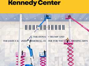
Reading Between the Letters at the Kennedy Center
Written in stone. Spaced on purpose. When Trump’s name was added to the Kennedy Center under a blue tarp, the story was not just process or policy. It was design. Public architecture speaks before we read it. Typography shapes how legitimacy and legacy are framed. Same classical Roman lettering. Different spacing. Kennedy’s inscription is tightly tracked, cohesive, institutional. Trump’s is more widely spaced. The letters breathe. The name occupies more space. That choice mat
1 min read


How Hallmark Turned Christmas into a Commercial Tradition
How Hallmark Turned Christmas into a Commercial Tradition
Hallmark played a significant role in the commercialization of Christmas by popul
2 min read


Why AI-Generated Work Should Never be Eligible for Copyright
HelloDelanie and Be Super Creative Principal, Delanie West talks AI and Copyright with Matthew S. Schwartz of Bloomberg Law's Uncommon Law.
1 min read