Search


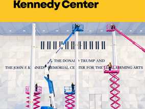
Reading Between the Letters at the Kennedy Center
Written in stone. Spaced on purpose. When Trump’s name was added to the Kennedy Center under a blue tarp, the story was not just process or policy. It was design. Public architecture speaks before we read it. Typography shapes how legitimacy and legacy are framed. Same classical Roman lettering. Different spacing. Kennedy’s inscription is tightly tracked, cohesive, institutional. Trump’s is more widely spaced. The letters breathe. The name occupies more space. That choice mat
1 min read


Outgrowing the Toy Box: Beyond the Toy Fair, Beyond the Limits
The Toy Industry taught me how to create, adapt, and innovate—but real growth comes from knowing when to step beyond the familiar and build something bigger. Scrolling through all the Toy Fair posts this week takes me back to where it all began. My first official day of work wasn’t in an office—it was on the floor of Toy Fair at the Javits Center. No desk, no onboarding—just a directive: walk the floor, observe, absorb. The toy industry is an easy place to get comfortable, co
1 min read


SoLoMo (Social, Local, Mobile)
oLoMo is a marketing strategy that integrates social media, local engagement, and mobile technology.
1 min read


Is Personal Style Really Different From Food Styling?
Personal Style vs. Visual Flavor: How Fashion and Culinary Styling Are More Alike Than You Think.
2 min read


The Transformative Power of Storytelling in Branding No. #16
The Transformative Power of Storytelling in Branding No. #16
1 min read