Search


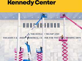
Reading Between the Letters at the Kennedy Center
Written in stone. Spaced on purpose. When Trump’s name was added to the Kennedy Center under a blue tarp, the story was not just process or policy. It was design. Public architecture speaks before we read it. Typography shapes how legitimacy and legacy are framed. Same classical Roman lettering. Different spacing. Kennedy’s inscription is tightly tracked, cohesive, institutional. Trump’s is more widely spaced. The letters breathe. The name occupies more space. That choice mat
1 min read


7 Trends Shaping the Marketing Industry in 2025
As we step into 2025, the marketing world continues to evolve rapidly. Staying ahead means understanding the trends shaping the industry....
3 min read


Have a Resume? Bet you don't have a Professional Bio. Why you need a Resume & Professional Bio as part of your personal brand strategy
In today’s competitive landscape, having a polished resume is essential—but it’s not enough. Resumes offer a snapshot of your work experienc
5 min read