Font Choices Are Policy Choices
- Hello Delanie

- Dec 11, 2025
- 3 min read
What the Times New Roman Debate Really Highlights
As a Graphic Design–disciplined CPG executive and Civic Creative Strategist in fellowship, I operate at the intersection of design, regulation, and public communication—so this issue resonates.
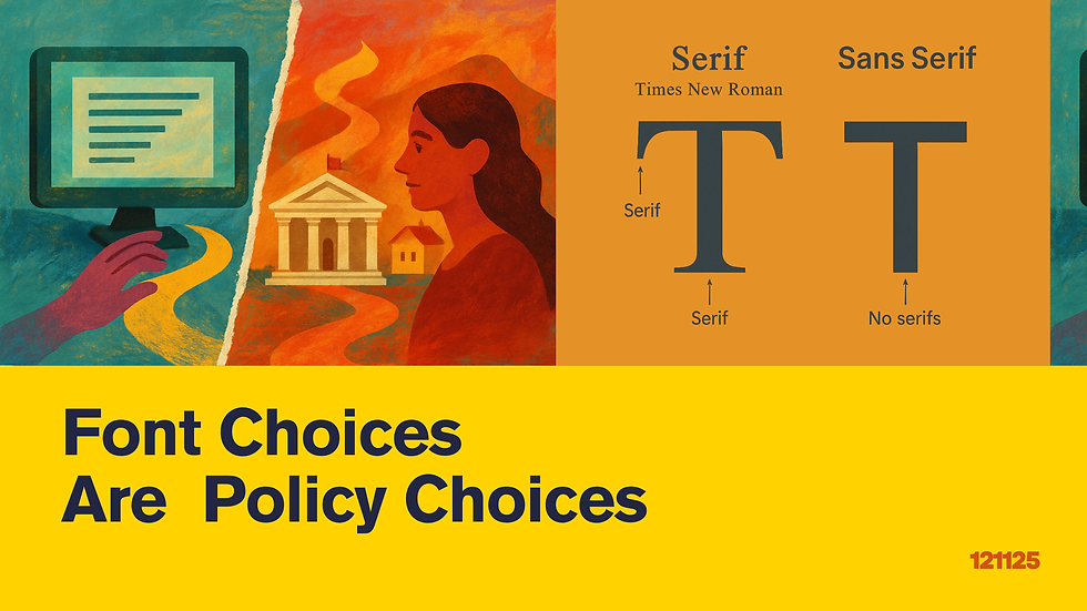
The recent order directing the State Department to return to Times New Roman for official communications has sparked attention, but the deeper conversation is not about nostalgia or aesthetics. It is about accessibility, digital readability, and the operational realities of government communication.
Calibri was not selected arbitrarily. Sans-serif fonts support better legibility for people with visual impairments, low vision, or reading disabilities, particularly on screens. As agencies shift toward digital-first public service, readable fonts become an accessibility requirement, not a branding preference.
Times New Roman carries a long legacy in print. In traditional memo formats, serif fonts perform well. But as more communication moves to mobile devices and small-format displays, serif fonts can introduce friction. Tighter spacing, thinner stroke contrast, and reduced clarity at smaller sizes can interfere with usability. A return to Times New Roman asks teams to reconsider formatting standards, templates, and accessibility guidelines to avoid compromising digital experience.
The conversation is not serif versus sans-serif. The conversation is how to match font standards to the purpose of the communication.
Print materials with formal structure may benefit from serif styles.
Digital materials intended for broad public access often require sans-serif fonts for clarity and inclusivity.
Accessibility must remain a baseline consideration, not an afterthought.
At the federal level, font decisions influence workflow, compliance, document design, and user experience across entire agencies. A dual-standard approach preserves formality where appropriate while ensuring digital communication remains readable and inclusive. Typography is not cosmetic. Typography is functional policy.
And here is the part that often gets lost in these debates. Leading, tracking, kerning. These are not abstract design terms for people who work in creative fields. They are variables that determine whether content is legible, readable, compliant, scalable, and cost-efficient.
I say this as someone who uses typography professionally and academically. I earned my undergraduate degree in Graphic Design. I learned fonts when you installed them from a CD. I am a printmaker with a quiet love of letterpress. Typography has always been more than decoration for me. It is structure, communication, and clarity. It is a system.
This week alone, I spent hours reformatting font standards for a client’s Haircare brand packaging. I needed to ensure the typeface included all required FDA-aligned label markings for compliance. I had to balance legibility, visibility, brand aesthetics, and regulatory accuracy. Adjusting leading, tracking, and kerning was the difference between producing two expensive packaging versions or designing one compliant, scalable solution.
This is what many policymakers underestimate. Font selection is not a stylistic preference. It influences accessibility. It influences the cost of printing. It shapes the visual trust of public information. It affects how quickly a brand or agency can scale. It can determine whether someone can read a document at all.
Typography is a tool. And when you work in government, design, or compliance, the tool you choose becomes policy.
DM me if you are working on communication, accessibility, or typography guidelines in your organization and want to discuss how design can function as civic infrastructure.
About Delanie West
Delanie West is a design and product development leader who applies creative strategy to both consumer brands and civic innovation. As the founder of Be Super Creative and Hello Delanie, she helps organizations translate complex challenges into clear design systems, scalable products, and purposeful communication.
Her executive background includes leading product development and brand strategy at Faber-Castell and Wilton Brands, shaping global assortments, packaging, and creative direction for major retailers and emerging brands. Her work has been featured by CNN Creative, Bloomberg, Fast Company, and the USPTO.
Delanie brings this same rigor to public-sector challenges through her civic strategy work, where she applies design thinking to strengthen housing, communication, and resident engagement systems.
She holds an MBA from Syracuse University’s Whitman School of Management and a design degree from Hampton University.
ConnectBeSuperCreative.com | HelloDelanie.comLinkedIn: Delanie West
besupercreative@hellodelanie.com | 908-242-6325


Comments